Everyone wants to be a better photographer— heck, even I do! Though I could consider myself experienced, having worked with DSLR cameras since the seventh grade, I still wouldn’t consider myself to be anywhere near the greatest (but I do have my moments!).
Having hosted plenty of photography workshops in my past, within the blog entry, I aim to teach you, or at least refresh, a couple of concepts that may escape us over time.
There’s three main things we will try to understand:
exposure
Just below. . . now that’s an amazing work of art. But how can we get our photos to process into visuals just as, if not more visually-appealing?
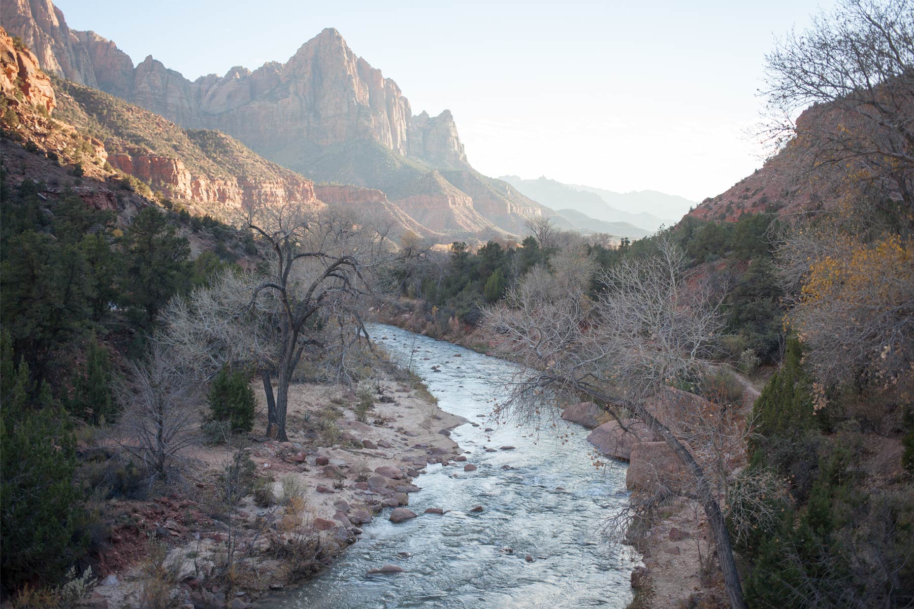
Let’s first understand how we define a ‘good’ photo, shall we?
Some photographers like to define the quality of their images through its resolution, or color-grading etc. But those can be altered by editing the raw image that we get when taking a photo. What most photographers actually judge their quality by is the exposure of a photo.
“What’s exposure?“
Let’s just think about the work exposure in a general sense. It’s defined as the state of being subjected to contact with something else. Knowing this, we can infer that within the context of photography, exposure is how we subject our camera to contact with light, as when taking a photo, your camera is opening its diaphragm for light to enter its body.
Here are some examples of exposure at different levels (above). If we think back to the definition of exposure, we can further infer that if we ‘over-expose’ a photo, we would be taking in too much light for its setting, resulting in a very bright photo (left) that can be understood as indigestible for the viewers. On the other end of the spectrum of exposure, a ‘under-exposed’ photo would result in a light-lacking photo that is dark, and the objects presented are indistinguishable. But right in the middle we find perfection. A properly exposed photo should capture a generally acceptable amount of color, lighting, and focus. Not too dark, not too bright, but just right.
Now, how do we control our camera to get it too result in properly exposed photos?
three controls
Aperture, ISO, and shutter speed. These are the main three settings that will control your exposure. Let’s start with aperture.
aperture
In rotating the dial that controls the aperture on your lens, you can widen or retract the metal panels that expose more or less of your camera to external light. This change is measured in units of “f/stops.” One thing you may notice is that the larger f/stop setting you set the camera to, the smaller the opening of the physical aperture will be.
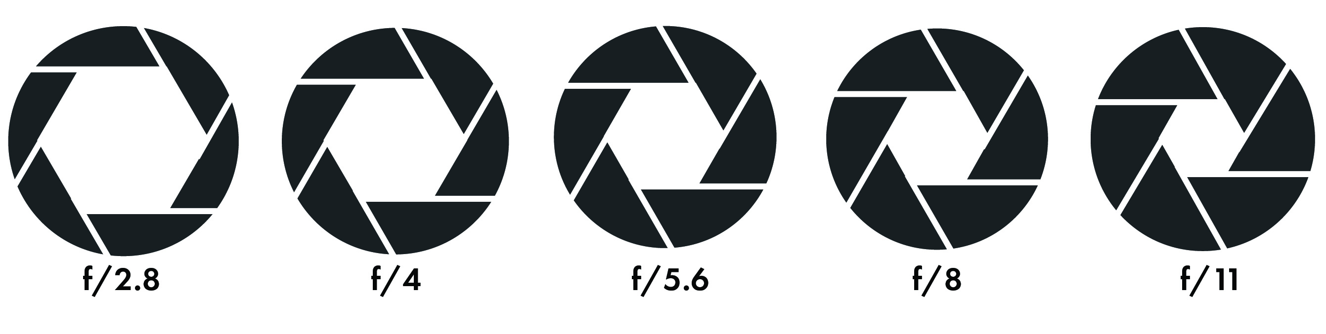
For example here, f/11 is a significantly smaller opening in the diaphragm as opposed to f/2.8 which presents a much larger opening. When taking a photo, you’ll also notice that the smaller the opening, the less light will be allowed through the diaphragm. This is one thing to consider when adjusting the aperture along with other settings.
Besides lighting however, the main role of aperture is to adjust the focal length. This can be better understood instead as adjusting the depth of field. One trend that I can’t exactly explain the science behind, is that the smaller the smaller the opening, the farther your depth of field will be. So just keep that in mind: larger aperture means farther depth of field, while smaller aperture means shallower depth of field.
iso
ISO is pretty much controlling how sensitive your camera is to light.
It’s denoted in measurements on an arbitrary logarithmic scale, so the difference between 100 ISO to 200 would be the same as between 400 to 800. You’ll notice that the higher you set the ISO, the brighter the image will appear.
In general, the manipulation of ISO is to balance the lack or surplus of light when altering the other two controls.
One thing that photographers should be weary of however, is grain. Though some find it to be visually appealing, in most cases it should be avoided depending on the situation. For those who don’t know, grain appears when the ISO is set too high, and it looks like this (below to left).
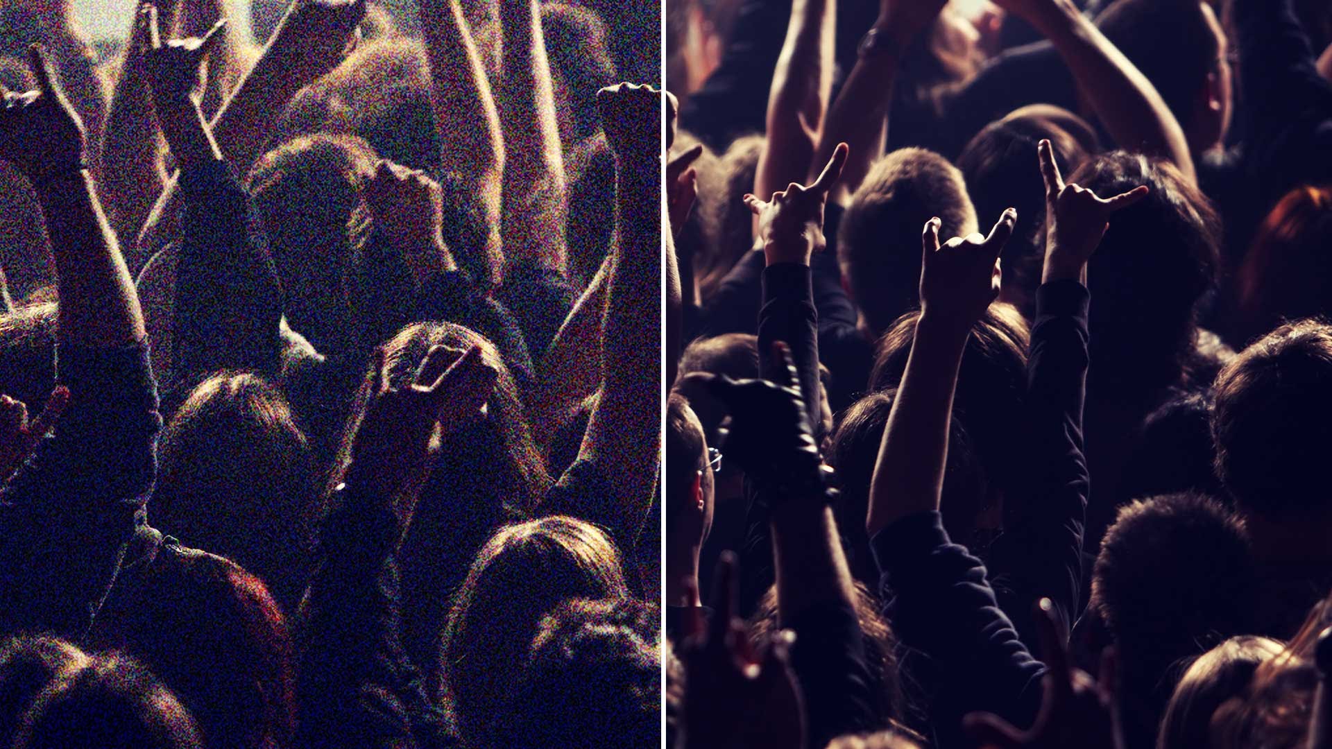
This is because when photons strike the camera sensor, they are converted into electronic signals for the camera to translate into an image. But when the ISO, or the sensitivity to light, is too high, shadows and darker objects present in the image are lacking strong signals of light for the camera to translate into a clear image.
So in summary, I would usually just set ISO to the automatic setting, which allows it to balance the change in exposure caused by the other two controls.
shutter speed
Shutter speed defines the speed at which the camera shutter operates. For those of you who don’t know, your camera contains a pair of curtains that start opening as you peer through the little display. When you take a photo, those shutters cover the display, and then make a sweeping motion to expose the camera to light. That was a pretty bad explanation but you can get an idea of how it moves down here.

The shutter speed can be controlled to be slower or faster, and is denoted in units of time in seconds: like ¼ of a second. As you might have guessed, those time spans represent the speed at which the shutters operate and expose the camera to light. So the longer the shutter speed, the more light you allow in through the lens. Another thing you might realize is that as you expose the camera for a long period of time, the light, even with movement, would be blended into one if that makes sense. So essentially, the longer shutter speed, or the larger the integer, the more light and more change in light would appear in the photo.
Aside from adjusting our exposure, we can also make our photos even better through some proper framing rules to guide us.
framing
Some basic guides for framing that I love to utilize are the Rule of Thirds, guiding lines, and architecture. Let’s start with a well-established go-to.
rule of thirds
This is a simple rule of thumb for most situations when taking a photo. First thing you want to do is visualize a 3 by 3 boxed grid on your image when aligning it, like below.

Using that grid, you’ll then want to divide your landscape into three. Here (Above), the background has been divided into three sections: the foreground of this rock formation, a clear sky as the central level to look at, and the clouds to define the end of the photo. By doing this we create depth which makes for a more interesting view, making it out to be more of a digestible image instead of one large congested one.
Dividing the landscape first, you then want to try and create space. Though you have the focus of the image on the subject, you want to expand the landscape into something vast instead of very claustrophobic. This photographer does this well by utilizing a neat background to compliment the foreground. This also contributes to a digestible image as it isn’t totally overbearing.
After creating space, you can align your focus. A good rule of thumb is to align the subject on the intersections. This will compliment the space and divide the photo into two neat shots: the horizon, and the woman.
guiding lines
This one is a lot more situational, but given the opportunity to use guiding lines is good practice.
These photos demonstrate really good use of lines to pave a path for the audience to follow.
If you just take a look at this one here (Above), the photographer uses the road lines to define a direction for your eyes. If we start from the bottom, our eyes should gravitate towards the end of the road. What these lines do especially well is prevent you from looking at interrupting landscapes, like the grass. These are less interesting, so by giving a road to follow with the eyes helps avoid the uninteresting. Upon reaching the end of the road, we meet the true focus of the landscape, which is the clouds. This pretty much works the same in this instance, following the path of the bridge up until the doggy (Below).

architecture
Last of the framing tools that I want to talk about is when picturing architecture. A photographer that I especially admire is Yasuhiro Ishimoto. What they do extremely well is making the setting work for them. By using the natural framing of the building, Ishimoto directs the path of your eyes through the depth in each photo.
With so many layers of walls and doorways, your eyes are treated to a whole adventure when tracking the depth of the photo. If you look at the top left photo, you’ll notice that your eyes gravitate into the room as opposed to the surrounding pictured area to the right of the entrance. Similarly, the photo below has many layers and two paths developed: into the light and dark. All while being symmetrically sound, the contrast in the brightness also helps create an interesting visual— simple yet complex that the same time.

That’s essentially everything that I could possible share about the very basics of composing a photo. I hope that some of the concepts you are able to remember and apply if you choose to. See you another day!

Leave a comment